Regular traders and investors in the stock market use a variety of strategies to identify which stocks to invest in. You may believe they make quick selections, yet efficient trading requires much research and analysis. The goal of this research and analysis is to make transactions as profitable as possible while minimizing risks.
Several analysts and specialists use stock market charts to identify trends and track stock movement. Consequently, it is necessary to know how to read stock market charts. You may be new to trading, but with a little guidance and thorough research, you can master it.
Learn stock market charts!
Before learning how to interpret stock market charts, you should understand what they are. Stock market charts are visual tools that depict lines and curves to inform traders and investors about market trends and stock price movements. Stock market charts help traders and investors evaluate how a stock is performing and whether there are price changes or volatility. This provides traders and investors with the necessary knowledge to make informed decisions and reduce trading risks.
Types of Stock Market Charts
Depending on the level of depth and your familiarity with reading and studying stock market charts, you may choose to refer to a variety of charts. Furthermore, different stock market charts provide varied insights into a stock’s operations and market performance. Here are several sorts of stock market charts:
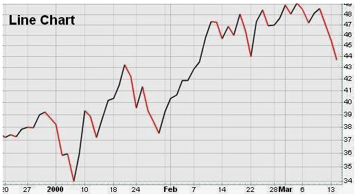
Line Charts
When it comes to learning how to interpret stock market charts, these are the most basic and straightforward kind of charts available. Line charts show the closing values of stocks over a certain period. Line charts may not be considered detailed stock charts because they just provide a general notion of stock movement.
Bar Charts
Bar charts provide more information than line charts. In this way, they provide a thorough representation of stock data. Each bar in a bar chart displays the high, low, opening, and closing prices for a specific time period. The top of the bar reflects the highest price, while the bottom shows the lowest price. Horizontal lines on either side indicate the stock’s opening and closing prices.
Candlestick charts
While learning how to read stock market charts, you will come across candlestick charts. Candlestick charts originated in Japan and provide the same information as bar charts, but with greater visual detail. The ‘body’ of the candlestick represents the difference between a stock’s opening and closing values, while the ‘wick’ depicts the stock’s high and low prices.
Understanding Chart Patterns
Looking at a stock market chart for the first time can be confusing, but if you understand the lines and patterns on charts, you may be more prepared to read and interpret them. Chart patterns are essentially the shapes (such as curves and lines) that occur on stock market charts. They can provide hints about future stock price fluctuations. When learning to interpret stock market charts, you should be aware of the following common patterns:
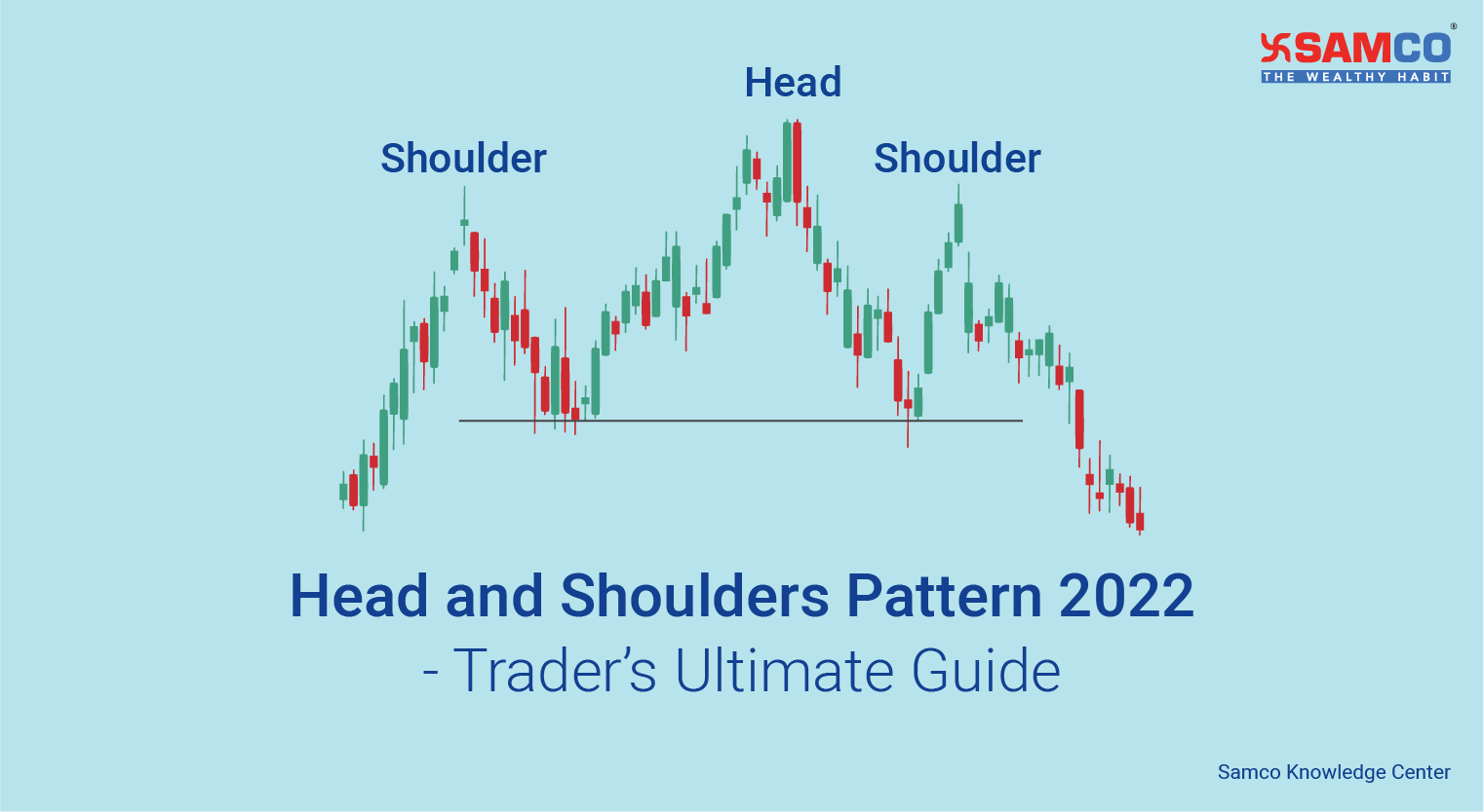
Head and Shoulders
This pattern indicates the reversal of an uptrend. The pattern has a peak (head), a higher peak (shoulder), and another equal peak (head). The line connecting the low points is referred to as the ‘neckline’. The pattern is completed when the price falls below the neckline.
Cup with Handle
The cup and handle pattern indicates a continuation of an uptrend. It resembles a cup with a handle. The ‘cup’ is actually a bowl-shaped pattern, while the ‘handle’ is a short pullback with a breakout and expanding volume following it.

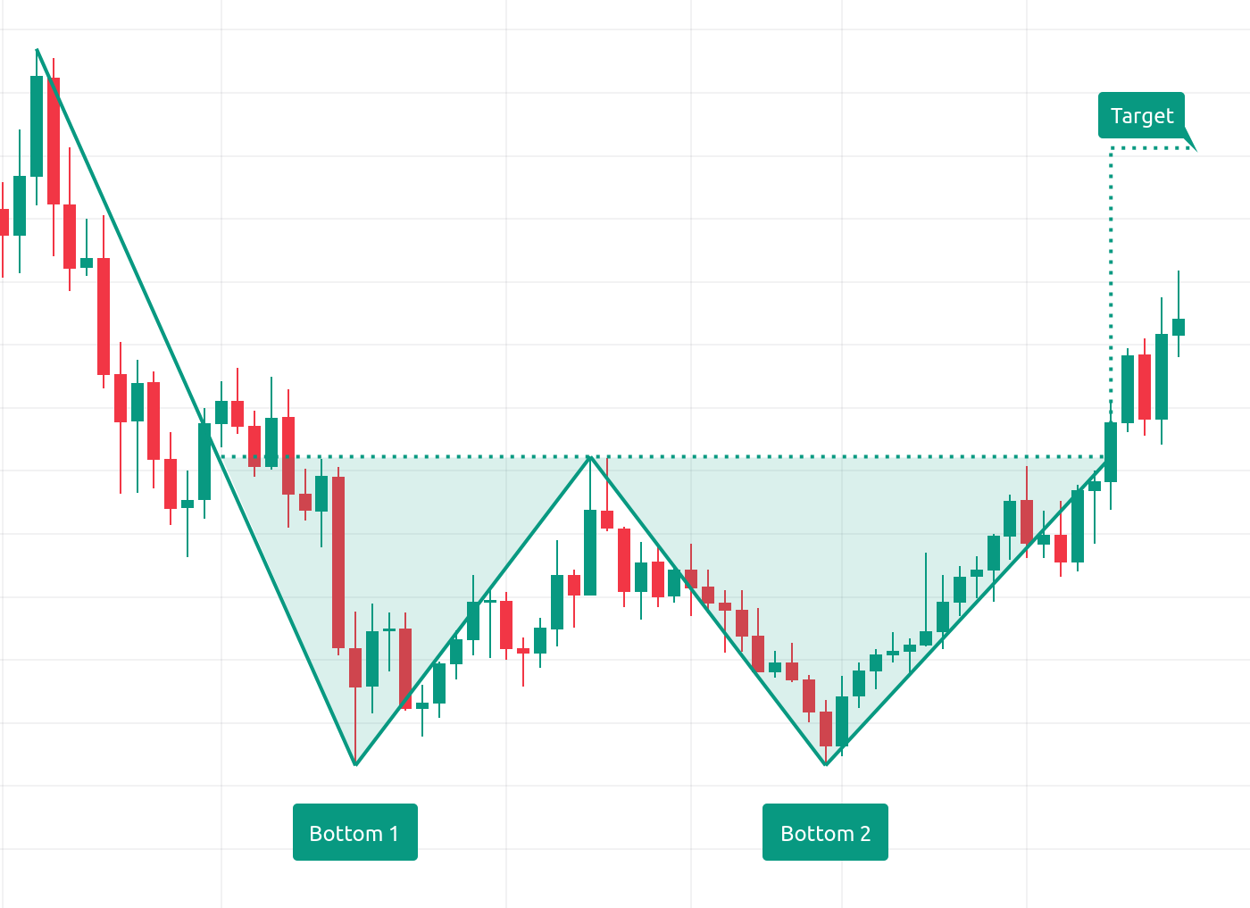
Double Top and Double Bottom.
When learning how to read stock market charts, these patterns indicate a reversal of a trend when a stock has broken through a given level twice. A double top is formed when two almost equal highs are followed by two virtually equal lows.
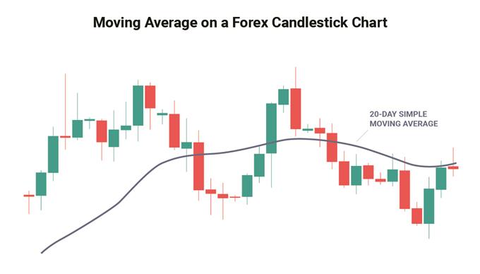
Moving Averages
Moving averages are useful for smoothing out pricing data and identifying trends over time. The two most common types of moving average indicators are the SMA (simple moving average) and the EMA (exponential moving average).
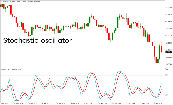
Indicators and oscillators
Indicators and oscillators are mathematical computations based on a stock’s price, open interest, and volume. They assist you in predicting the future price movements of a company.
Moving Average Convergence Divergence
MACD or Moving Average Convergence Divergence assesses the relationship between a stock’s two moving averages. It consists of the signal line, MACD line, and histogram.
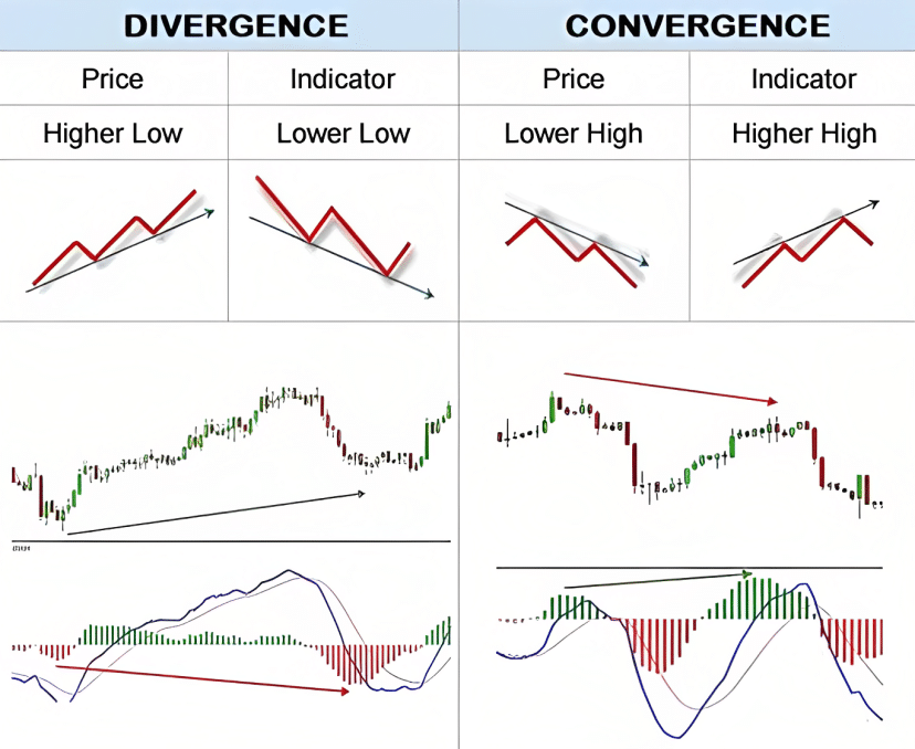
Relative Strength Index
The relative strength index (RSI) evaluates the change and speed of a stock’s price fluctuations. It oscillates between zero and one hundred. Traditionally, the stock is believed to be overbought when it exceeds 70 and oversold when it falls below 30.
Read Stock Market Charts Easily.
Reading stock market charts may be considered a skill that is essential. Many investors spend time and effort in this process as it helps them to make potentially profitable trades and lessen potential risks. Stock charts can be useful tools and when you know how to interpret them, you are better equipped to make investment decisions that match your unique financial needs and risk appetite.
Feeling lost deciphering stock market charts?
Don’t worry!
Divadhvik is your key to unlocking their secrets. By understanding charts, you’ll identify potential opportunities, manage risk, and invest with confidence.
We offer a comprehensive package: expert consultations, and a user-friendly app for on-the-go charting and portfolio tracking.
Download the Divadhvik app today and take charge of your financial future. Let’s navigate the market together and achieve your investment goals!